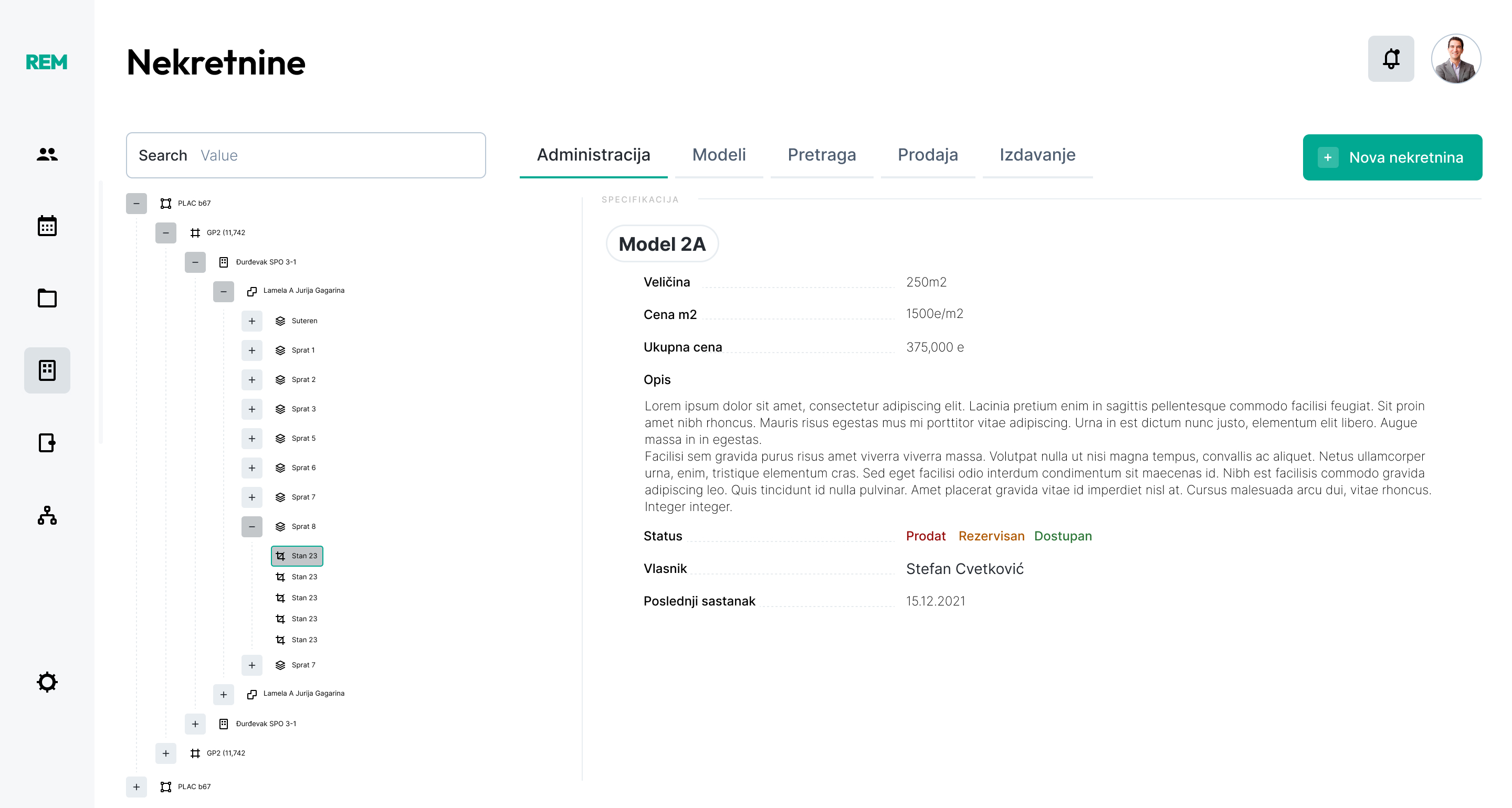
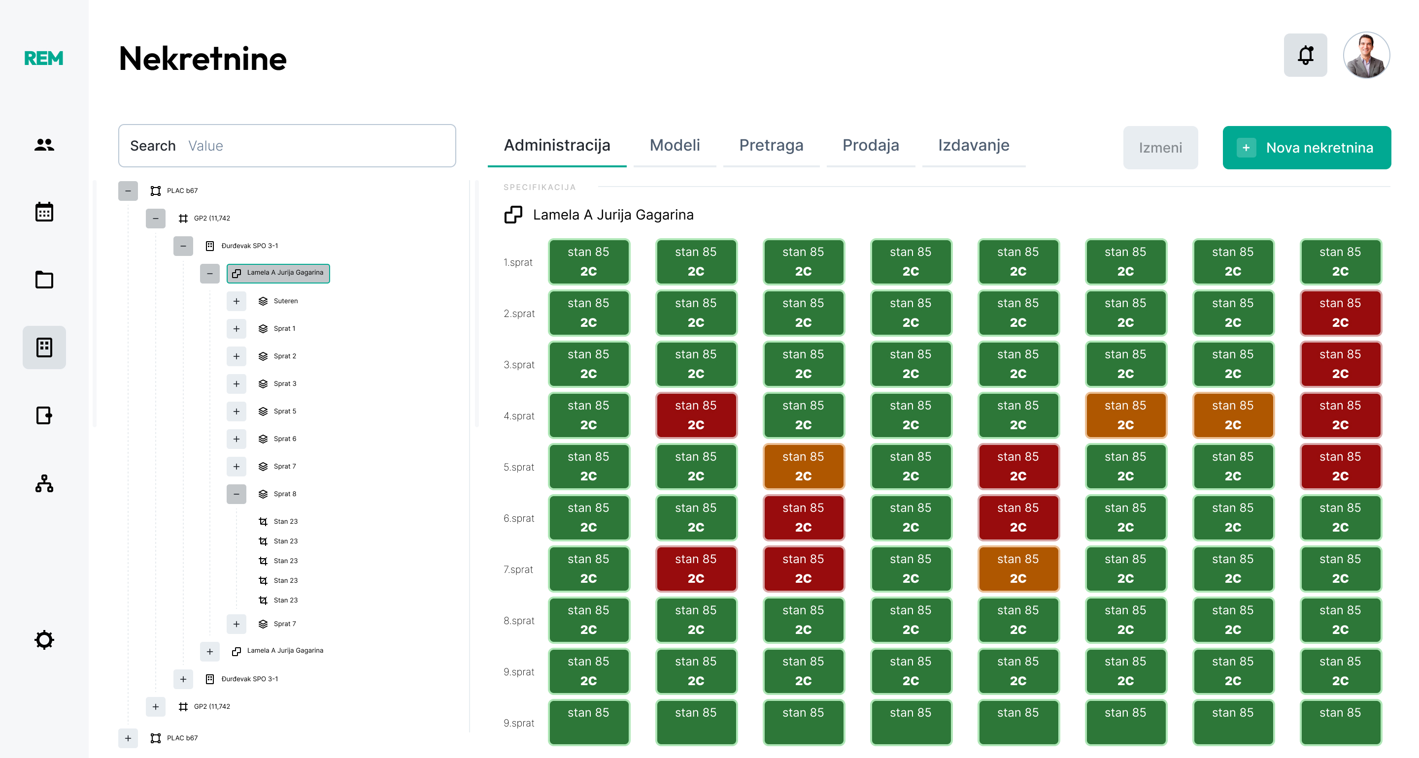
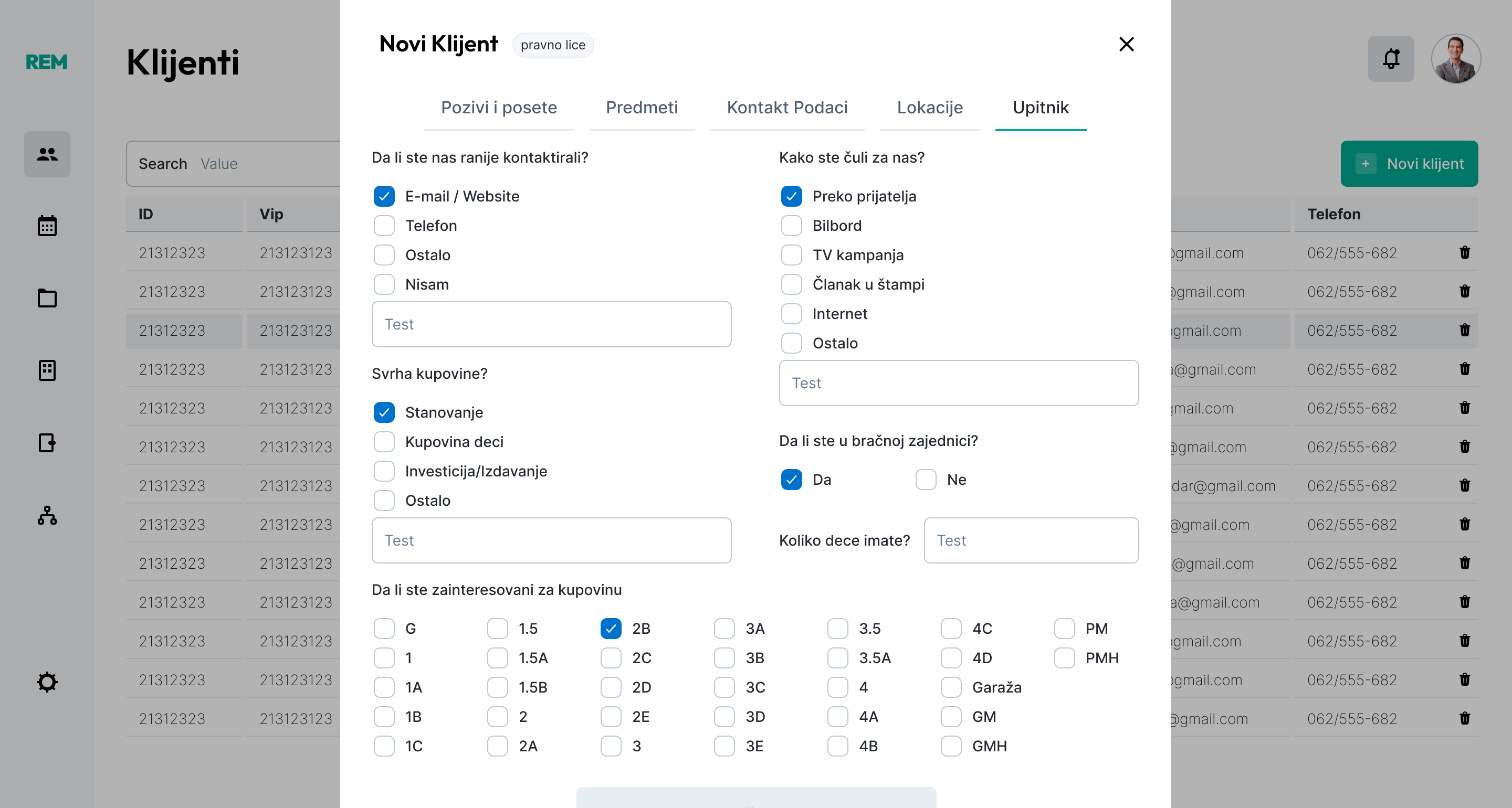
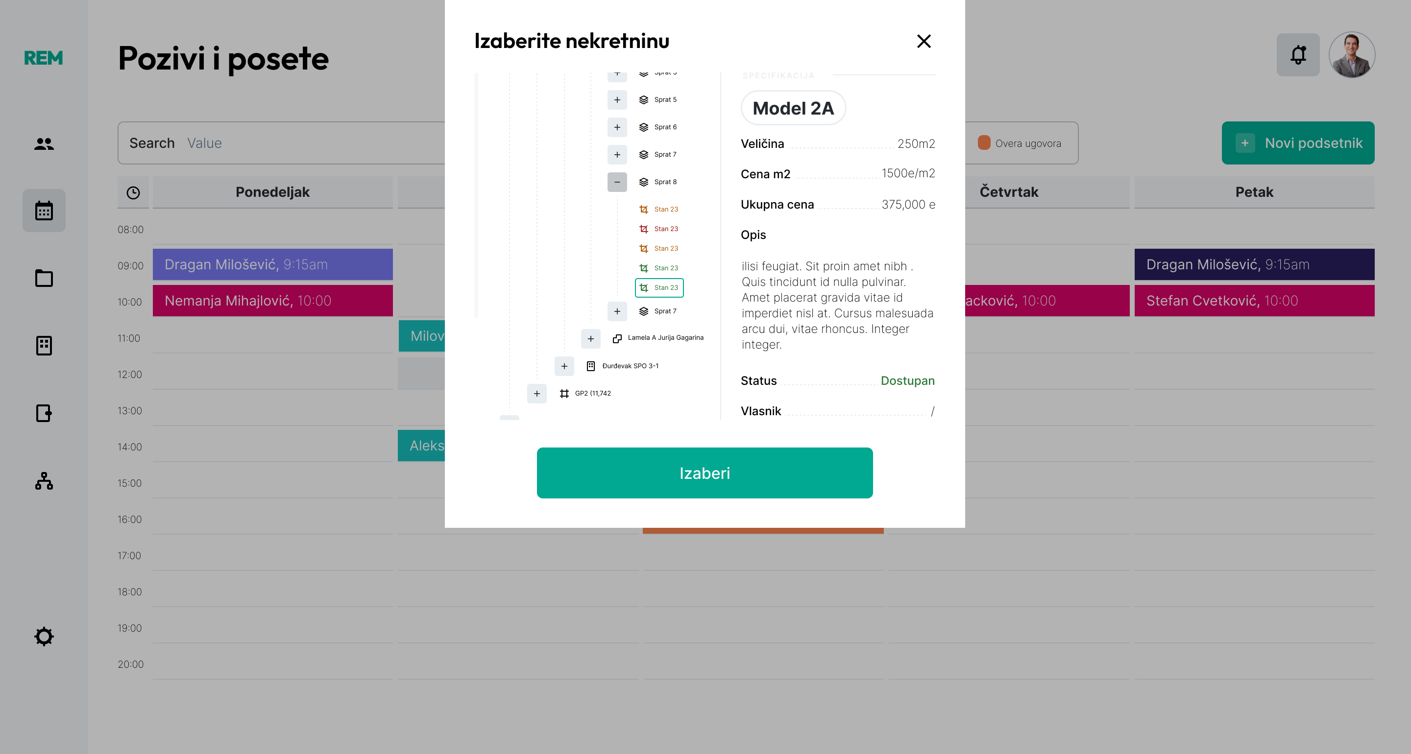
The Solution
I redesigned the platform with a focus on visual hierarchy and
touch-point optimization:
Visual Inventory Management: Replaced text lists
with a color-coded grid system (green for available, red for sold, orange for reserved) to give agents an
instant "birds-eye view" of building availability.
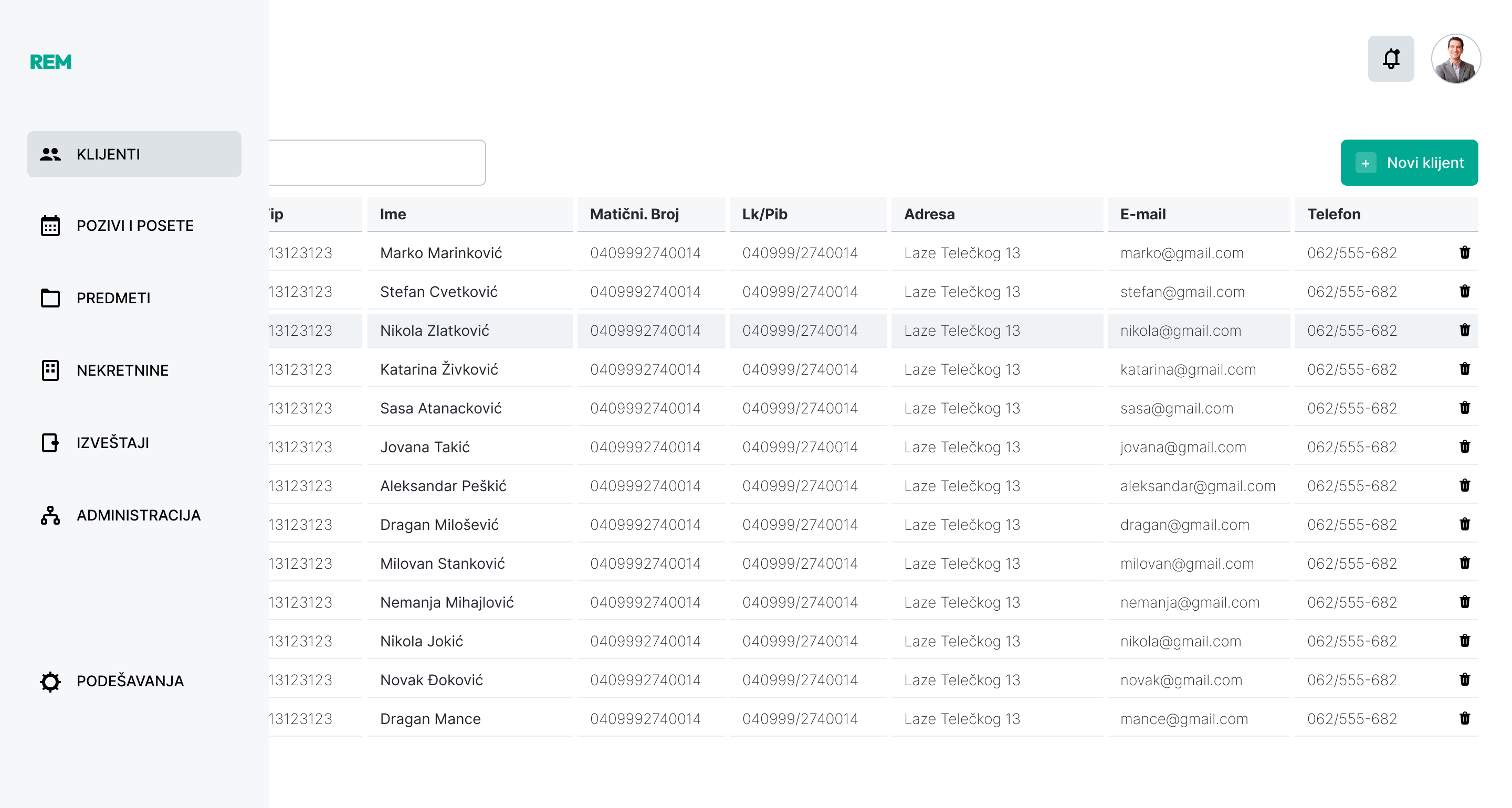
Tablet-First Interaction: Increased hit areas and
introduced clean, modal-based forms for adding new clients and scheduling visits, ensuring the app is fully
functional on the go.
Streamlined Data Hierarchy: Organized complex
property specs (size, price, owner info) into a clean, collapsible tree-view sidebar, allowing for quick
navigation between floors and units.